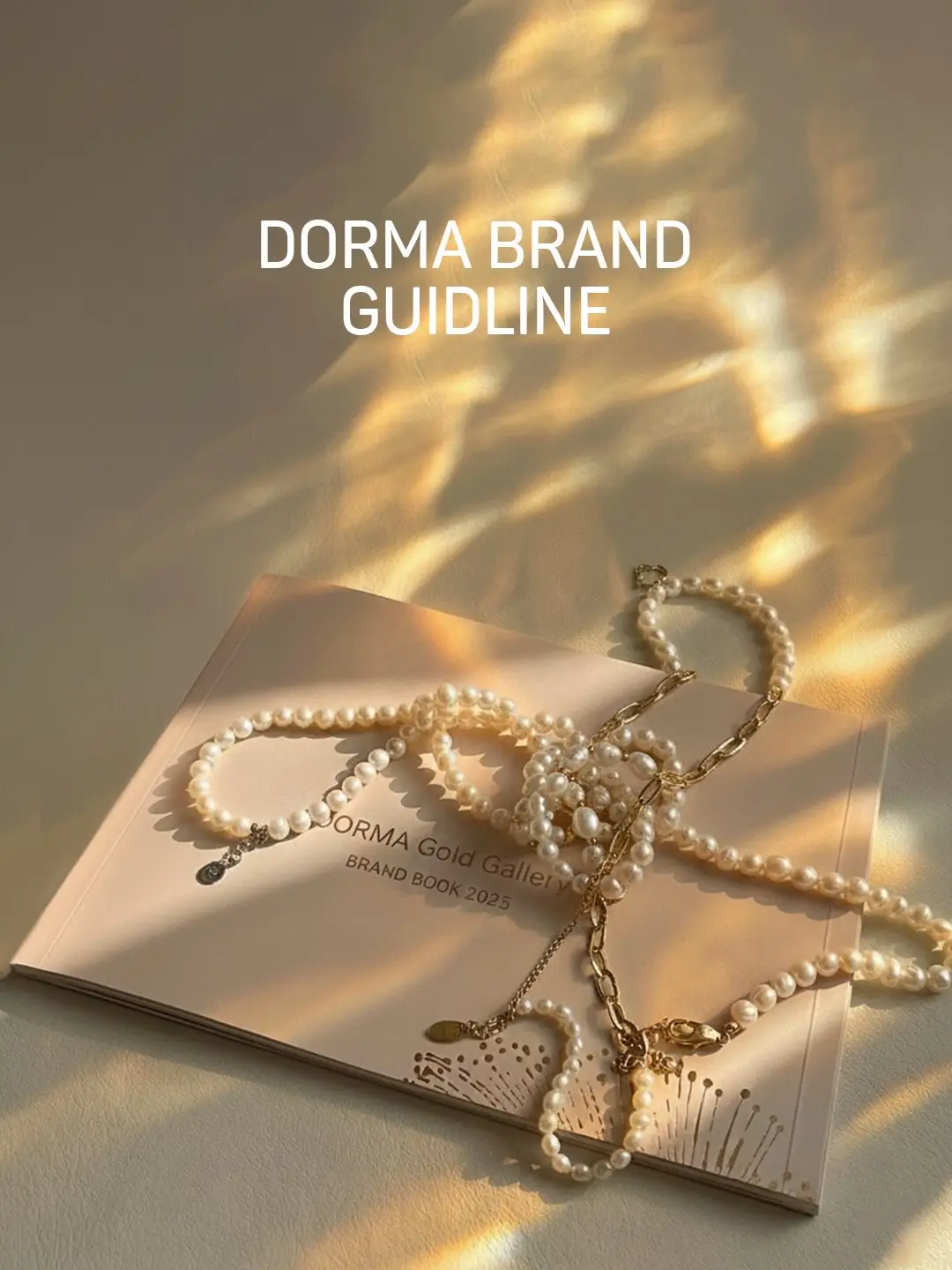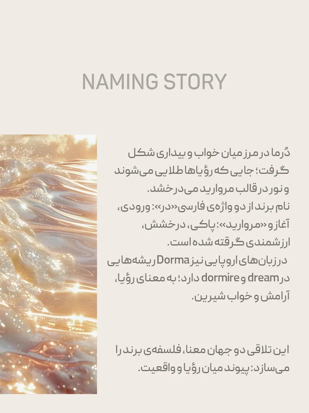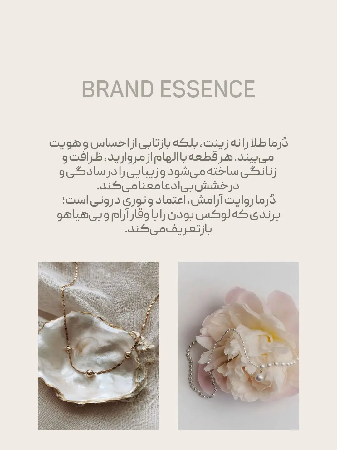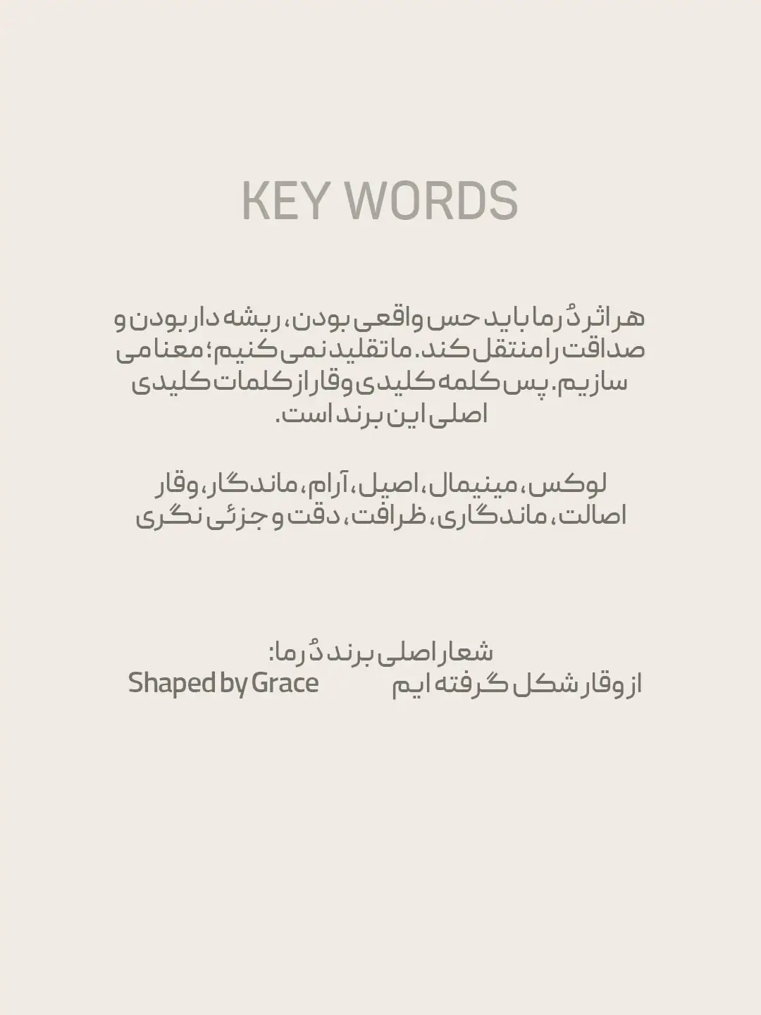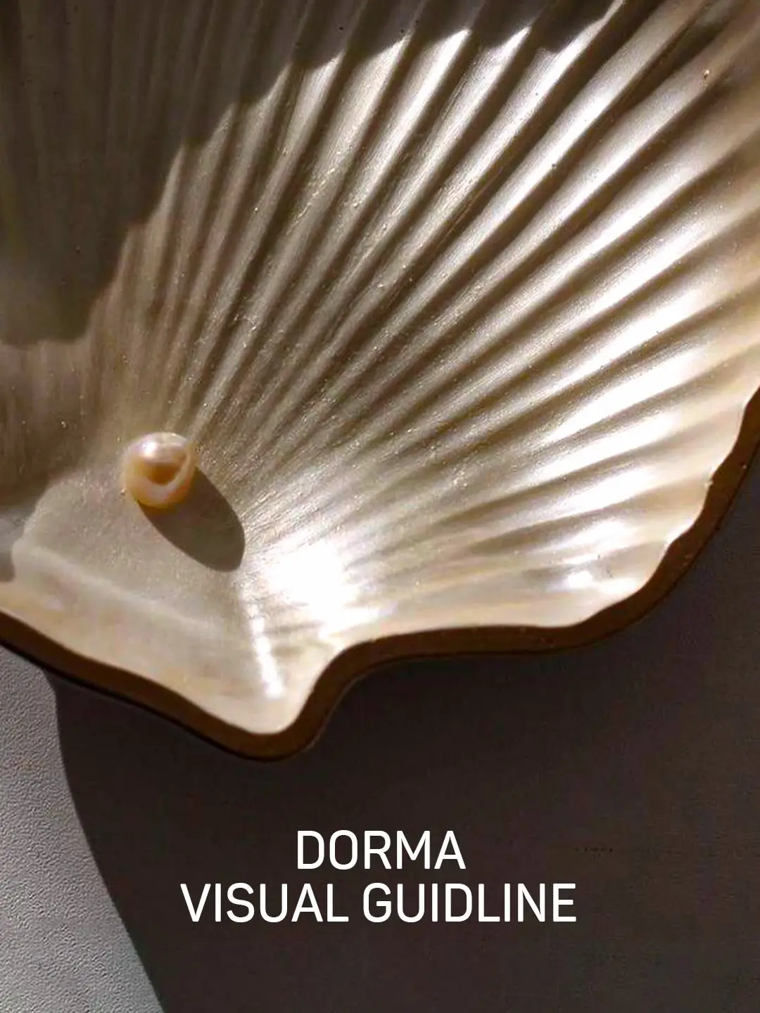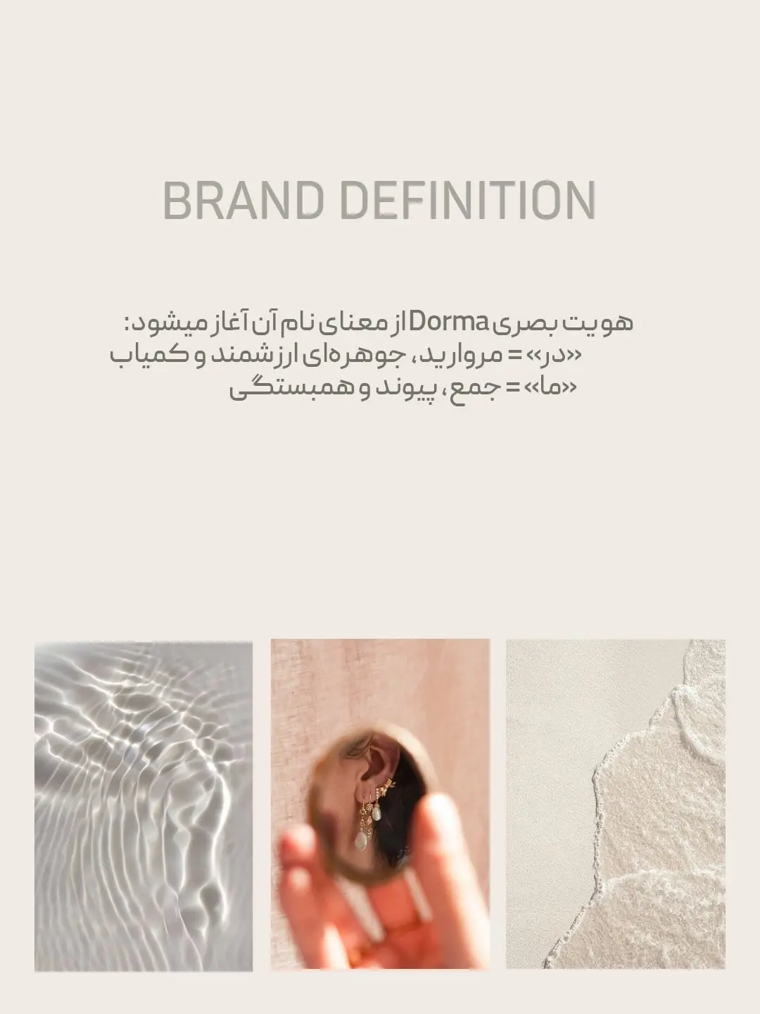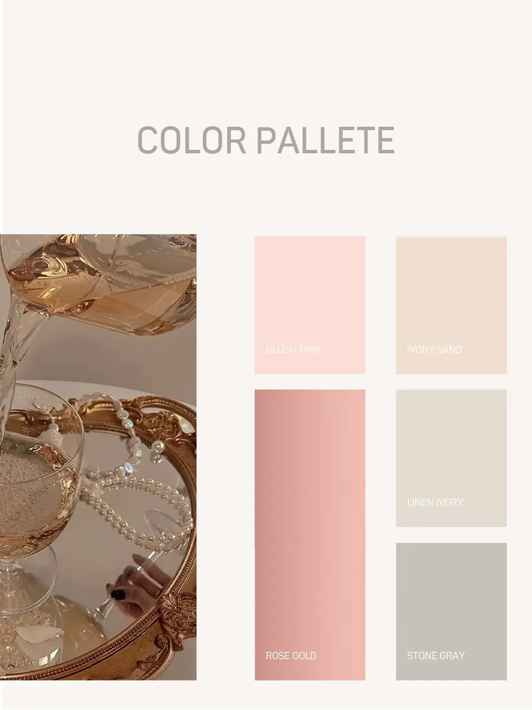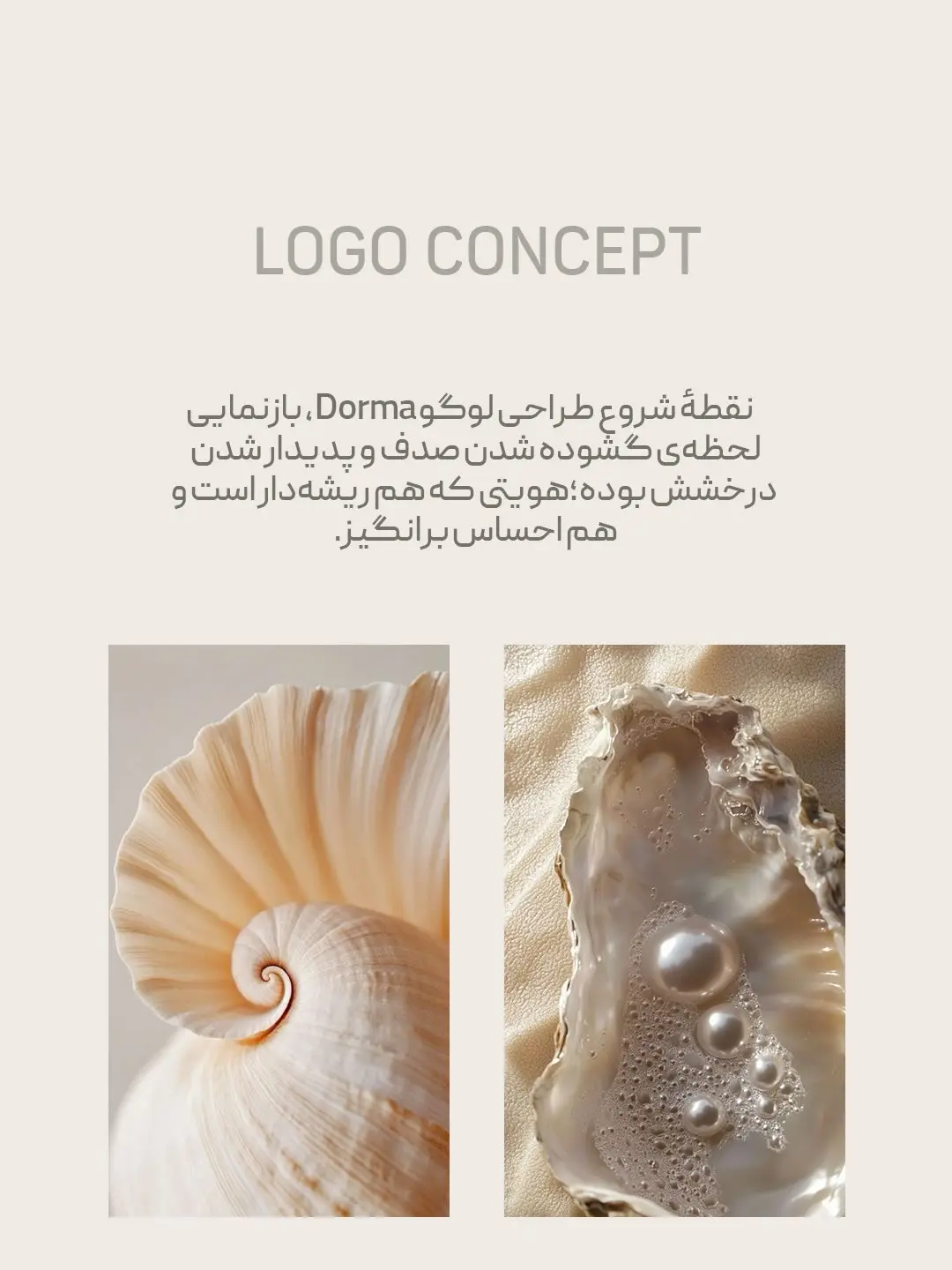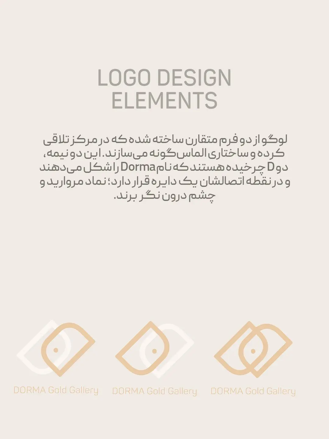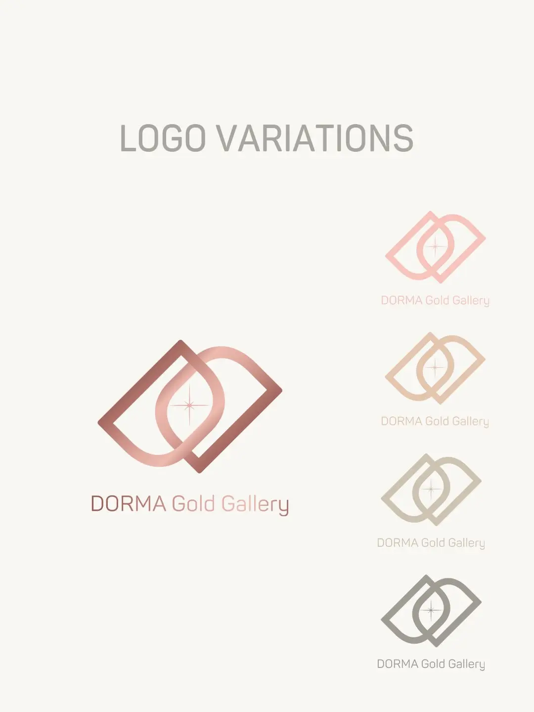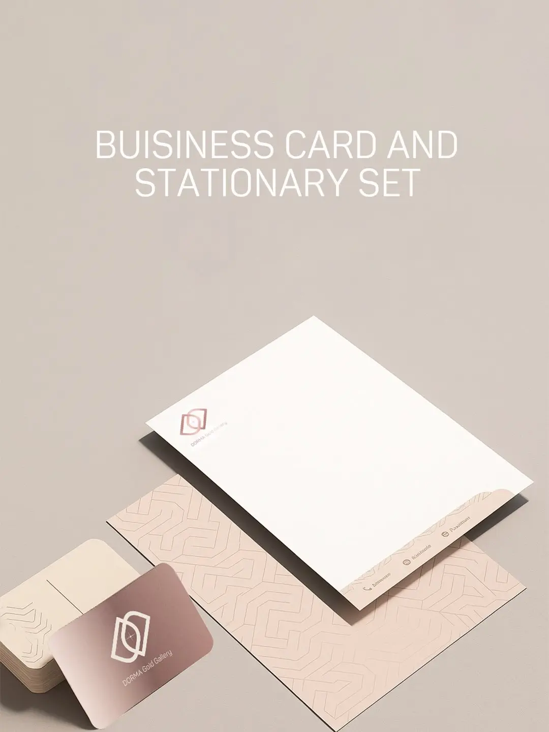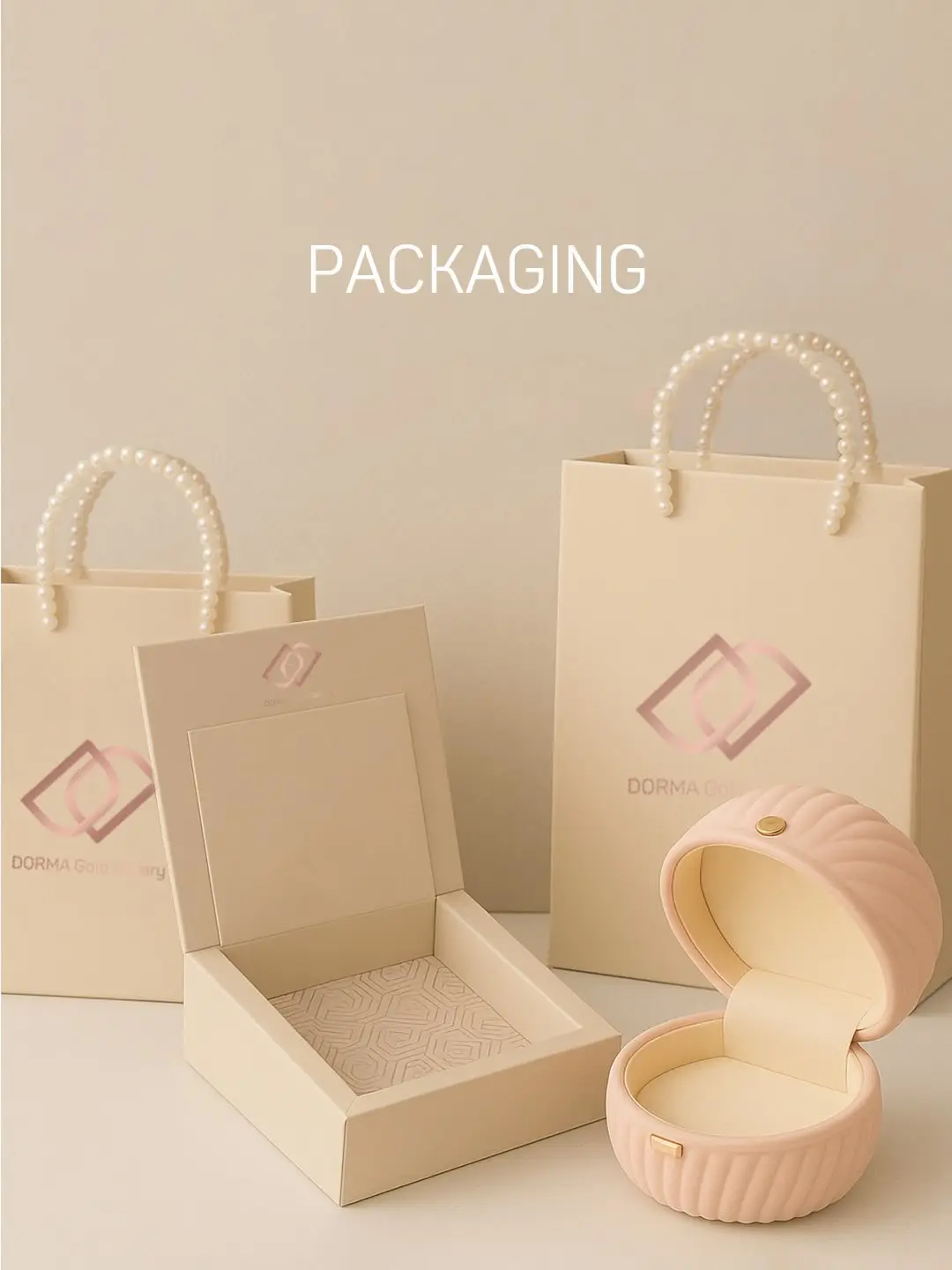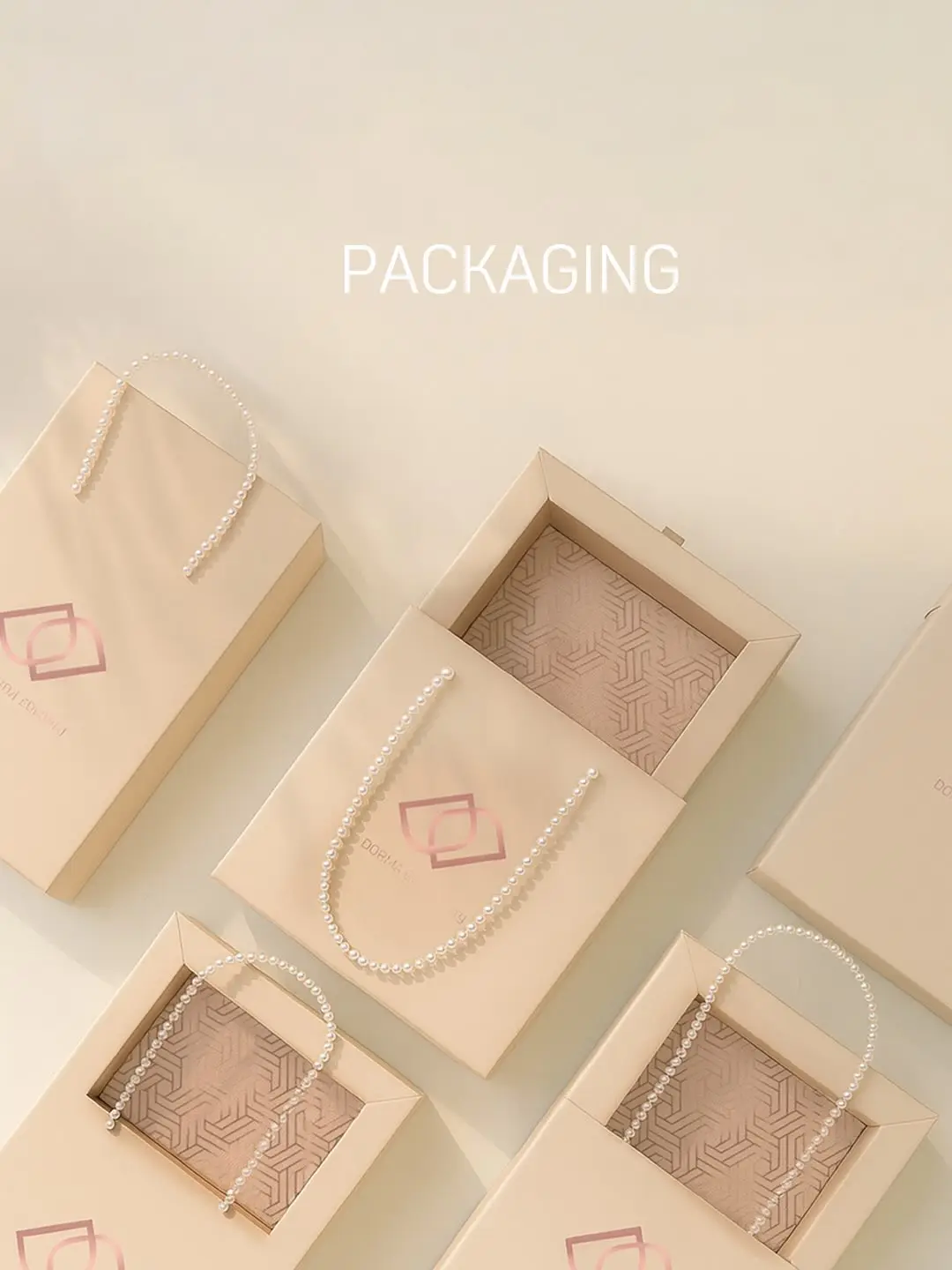
Naming, logo and packaging for a single identity
The brief
Build an identity from nothing: no name, no mark, no colour, no rule about how any of it behaves when it meets a real surface.
The idea
Do it in order, and do not skip the naming. A name is the one decision every later decision inherits — the logotype is drawn around it, the packaging has to carry it at small sizes, and a name chosen carelessly quietly taxes every piece of design that follows for the life of the brand.
What we made
Naming, then the logotype and the reasoning that arrived at it, then the colour system, then the packaging and stationery. The last part matters more than it is usually given credit for: an identity that only exists as a file has not been tested. It gets tested the first time it is printed at a real size on a real material and handed to somebody.
A note on attribution
This one is published without the client’s name. That is the client’s preference, not an omission — the work is real and the images are the actual deliverables. KHN does not put a client’s name on a public page before the client has agreed to it.
We do not decorate a business. We give it a world to stand in.